- Case Studies
- GridCraft: Svelte Data Visualization Component
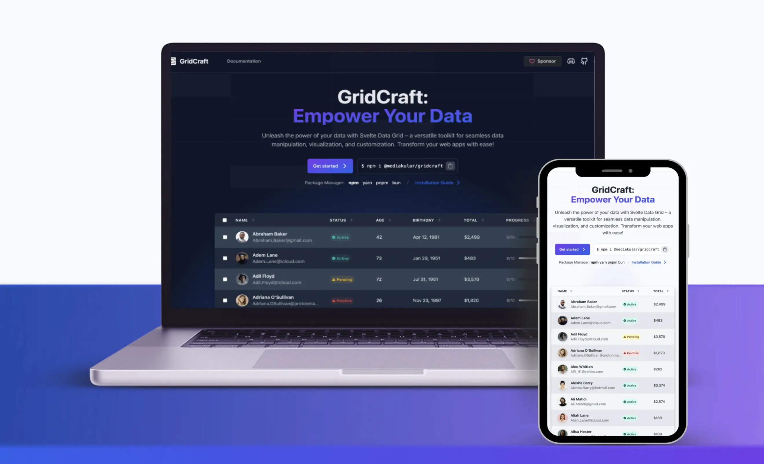
GridCraft: Powerful Open Source Data Visualization Component
GridCraft is an open-source project aimed at providing developers with a flexible and powerful headless Svelte component for visualizing data in grids or simple tables. The project required a comprehensive solution that would be easy to set up and integrate while offering advanced features and customization options.
We developed GridCraft as a versatile Svelte component that offers three predefined themes, comprehensive documentation, and a range of features including custom filters, columns, pagination, grouping, and row selection. We ensured that theme changes and implementations were straightforward, catering to developers of various skill levels.
GridCraft has become a go-to solution for developers seeking a robust, open-source data visualization component. Its ease of use, flexibility, and comprehensive feature set have made it popular among the Svelte community, contributing to more efficient and visually appealing data presentations in web applications.
The Challenge
We needed to create a component that was easy to set up for simple tables, yet powerful enough to handle complex data visualization needs. Striking this balance required careful architecture and intuitive API design.
The Solution
Modular Architecture
We designed GridCraft with a modular architecture, allowing users to easily add or remove features as needed. This approach provides simplicity for basic use cases while offering the flexibility to incorporate advanced features.
TypeScript Implementation
By using TypeScript, we ensured type safety and improved developer experience, making it easier for developers to integrate and extend GridCraft in their projects.
Virtual Scrolling and Lazy Loading
To optimize performance, we implemented virtual scrolling and lazy loading techniques, allowing GridCraft to handle large datasets efficiently.
Interactive Documentation
We created comprehensive, interactive documentation with live examples, making it easy for developers to understand and implement GridCraft's features.
Flexible Theming System
Our theming system includes three predefined themes and a straightforward API for custom theme creation, catering to both quick implementation and advanced customization needs.
About the Project
GridCraft is a next-generation UI component library built entirely in Svelte, designed to transform the development of data visualization and user interface design. Focused on flexibility, customization, and performance, GridCraft enables developers to create dynamic, responsive, and visually stunning data grids for their web applications.
Motivation Behind the Development
GridCraft was created to simplify data management tasks for SvelteKit developers. Frustrated by the lack of robust and flexible data grid solutions for Svelte applications, I set out to build a powerful, versatile, and user-friendly tool. My goal is to empower developers to unlock their data’s full potential, enabling them to build more efficient applications.
Goal of GridCraft
GridCraft emerged from a pressing need for a more efficient tool to handle data within SvelteKit projects. Frustrated by the limitations of existing options, the goal was to create a unified solution that seamlessly blends power, versatility, and ease of use. By equipping developers with the tools to extract maximum value from their data, the vision is to foster the development of superior, more efficient applications.
GridCraft’s Mission
The primary objective of GridCraft is to provide developers with a comprehensive arsenal for constructing sophisticated data grids that effortlessly integrate into their projects. By harnessing the capabilities of Svelte, Tailwind CSS, HTML, and CSS, GridCraft delivers a robust foundation for crafting exceptional user interfaces and visualizing data, catering to the diverse demands of contemporary web development.
Crafting GridCraft: A Strategic Approach
GridCraft was meticulously designed with a strong emphasis on modularity, expandability, and user-centricity. By leveraging Svelte's reactivity, Tailwind CSS's utility-first philosophy, and modern web design best practices, the library offers a streamlined development experience.
Through a well-structured architecture and clearly defined interfaces, GridCraft simplifies the process of building intricate data grids, enabling developers to focus on creating exceptional user experiences.
A paramount focus during development was to ensure unparalleled ease of use. The aim was to create a tool that minimizes reliance on external dependencies and offers a smooth learning curve for users of all skill levels. Whether constructing basic tables or intricate data visualizations, the goal was to make GridCraft accessible and intuitive, demanding minimal configuration knowledge to initiate. This led to a design philosophy centered around simplicity and efficiency, empowering developers to concentrate on core objectives without being hindered by complex setups or steep learning curves.
In this example GridCraft will automatically detect the properties of type Client and generate a column for each property:
<script lang="ts">
import { Grid } from '@mediakular/gridcraft';
import { clients } from './clients.js';
</script>

<Grid data={clients} />
Example for a simple use of the GridCraft component
The code of the example results in the following table:

Tailoring GridCraft to Your Vision
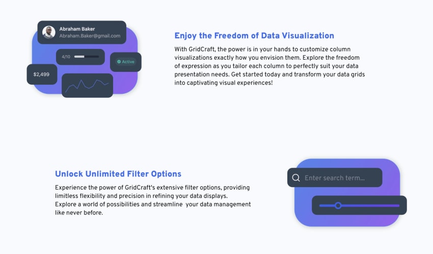
GridCraft adopts a headless architecture, granting developers complete control over the visual style of their data grids. Theming is achieved exclusively through components, offering unparalleled flexibility and customization. This approach empowers developers to effortlessly align the appearance of their grids with the unique aesthetic of their applications, guaranteeing seamless integration and brand consistency.
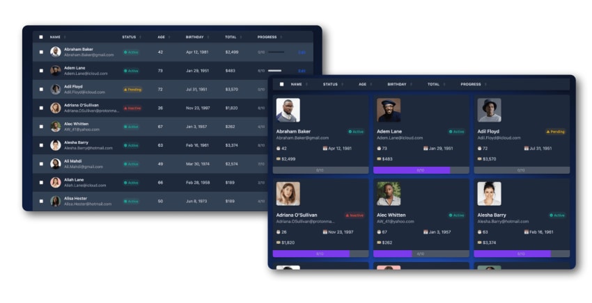
The library includes three pre-configured themes, meticulously crafted to serve as a foundation for customization. These themes exemplify design and layout best practices while showcasing the theme system’s extensibility. Each theme is fully adjustable and can be effortlessly modified to meet specific design requirements.
Furthermore, GridCraft enables developers to create custom themes from scratch, utilizing Svelte’s powerful component-based architecture to craft distinctive visual experiences tailored to their project’s needs. From sleek, modern interfaces to nostalgic retro designs, the possibilities are boundless with GridCraft’s theming capabilities.
Configuring table themes is incredibly straightforward. Themes can even be dynamically swapped during runtime. Simply import the desired theme and assign it to the Grid component using the "theme" property:
<script lang="ts">
import { Grid, type GridColumn, GridFooter, PrelineTheme, PlainTableCssTheme } from "@mediakular/gridcraft";
import { clients } from './clients.js';

let theme = PlainTableCssTheme;
let columns: GridColumn<Client>[] = [...];
</script>

<!-- Only for demonstration purposes -->
<button on:click={() => theme = PlainTableCssTheme}>Plain Css Theme</button>
<button on:click={() => theme = PrelineTheme}>Preline Theme</button>
<!-- End: Only for demonstration purposes -->

<Grid bind:data={clients} {columns} {theme} />
<GridFooter {theme}/>
Basic example for theming in GridCraft
The GridCraft Journey
GridCraft’s development was an iterative, collaborative process fueled by a passion for exceptional code and innovation. Each feature and enhancement underwent rigorous testing and refinement to guarantee reliability, performance, and cross-platform compatibility. Consistent feedback from the community played a pivotal role in shaping the project’s direction, guiding decision-making, and prioritizing enhancements.
Start of the Development Process
The project’s inception stemmed from a larger initiative that necessitated a versatile data grid with a wide range of capabilities. Unable to find a suitable existing library, the decision was made to build a custom component.
This provided an ideal opportunity to delve into the intricacies of creating a tailored solution. Working within a real-world context allowed for the implementation of diverse features, experimentation with sample data, and rapid testing across various application pages with distinct requirements. This iterative process facilitated thorough refinement and optimization, ensuring the final product seamlessly integrated into various environments while meeting diverse user needs.
Challenges during the Development
Challenges inevitably arose during development, many stemming from the desire to maintain simplicity and ease of use for developers interacting with the component. Balancing functionality with user-friendliness proved to be a delicate task, often introducing complexities during implementation.
However, the most significant hurdle emerged when addressing the data flow of the paging system. The goal was to create a paging mechanism that was not only optional but also highly adaptable and seamlessly integrated with the grid component. This required a flexible architecture capable of handling changes in paging data from multiple sources without relying on page refreshes.
Bidirectional data binding posed the most significant challenge, frequently leading to loops and unpredictable behavior. Despite initial attempts using Svelte Stores to centralize data management, this approach lacked scalability and elegance.
By returning to the drawing board and creating a simplified prototype in an online editor, a thorough exploration of alternative solutions commenced. This led to the development of a novel approach that circumvented the pitfalls of bidirectional binding. By reimagining the data flow and leveraging Svelte’s reactive capabilities, a streamlined solution was devised that ensured seamless interaction between the grid component and its associated paging controls.
This experience underscored the importance of perseverance and creativity in problem-solving, ultimately leading to the discovery of a simple yet effective solution.
Following the project’s initial success, the decision was made to open-source the code on GitHub under the MIT License. Additionally, the library was packaged for distribution on NPM to share it with a wider audience. Soon after its release, the project gained traction within the community, with early adopters integrating GridCraft into their projects. Valuable feedback from these users highlighted minor bugs, suggested improvements, and sparked ideas for extensions, fostering a collaborative effort to enhance the component’s functionality and usability.
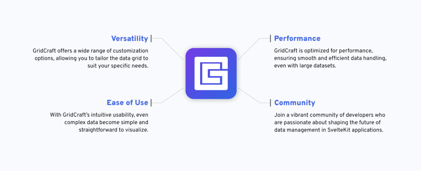
Core Features
In its initial iterations, GridCraft boasts a comprehensive array of features, encompassing:
- #️⃣ Paging: Effortless navigation through large datasets with paging
- ✨ Customizable Columns: Customization of grid columns to match data presentation needs
- 🔍 Advanced Filtering: Advanced filtering capabilities to refine data focus.
- 🔄 Sortable Columns: Sorting data columns in ascending or descending order for analysis.
- 🔗 Grouping Functionality: Grouping related data for enhanced insights and analysis.
- 🔄 Reactive Updates: Real-time updates for data, settings, and appearance.
- 🎨 Customizable Appearance: Customization of grid appearance to align with application design.
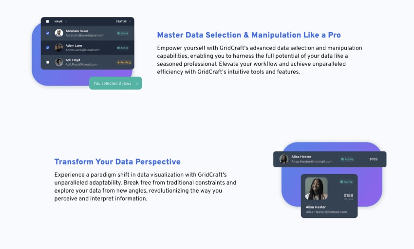
- ✅ Row Selection: Selection and manipulation of individual or multiple rows.
- 🖊️ Custom Row edit: Integration of custom or third-party components for data editing.
- 🛡️ Type Safety: Strong type safety through the use of custom business model types.
- 🌬️ Tailwind CSS ready: Complete compatibility with Tailwind CSS and other frameworks.
A Guide to Mastering GridCraft
GridCraft is accompanied by an exhaustive, user-friendly knowledge base, designed to equip developers with the tools and information necessary to optimize their workflow. Encompassing every facet of the library, from initial setup and configuration to advanced customization and utilization, the documentation serves as a thorough roadmap for both novice and seasoned developers.
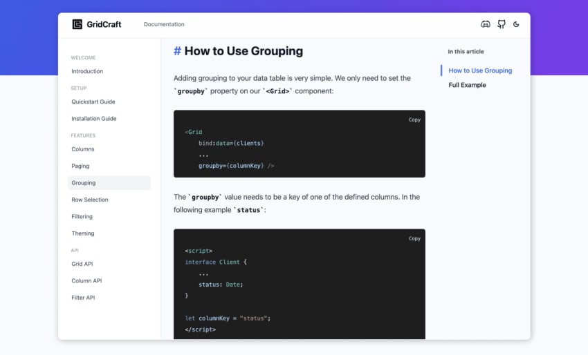
Featuring clear explanations, code samples, and step-by-step tutorials, navigating GridCraft's capabilities becomes effortless, allowing developers to seamlessly integrate robust data grids into their projects with confidence.
Furthermore, the documentation undergoes regular updates to reflect the latest enhancements and advancements, guaranteeing developers always have access to the most precise and current information. With GridCraft's comprehensive guide at your disposal, mastering the art of data presentation has never been more accessible.
GridCraft: A New Era of Data Visualization
In essence, GridCraft is a prime example of the potential of modern web technologies and the collaborative spirit of the open-source community. With its adaptable features, user-friendly interfaces, and unwavering commitment to quality, GridCraft empowers developers to elevate their projects to unprecedented heights, delivering exceptional user experiences and spearheading innovation in the realm of web development.
Technical Details
TypeScript
Primary programming language for type-safe development
Svelte
Framework for building the component
HTML 5
Markup language for structuring the component
CSS 3
Styling language for component appearance
TailwindCSS
Utility-first CSS framework for efficient styling
Git
Version control system for collaborative development