The Impact of UI/UX Design on E-commerce Success
Learn how cutting-edge designs in user interface and experience can significantly improve your online store’s conversion rates.

UI/UX design, at its core, is about creating a seamless and enjoyable experience for users as they interact with your digital product. UI, or User Interface, focuses on the visual aspects—what the user sees, how buttons, colors, and elements are laid out, and the overall aesthetics. UX, or User Experience, dives deeper into how a user feels while navigating through your site. Are they frustrated by slow load times or delighted by intuitive navigation?
From my personal experience, I’ve seen how businesses often underestimate the power of good design. It’s not just about making something look pretty—it’s about solving problems and guiding users towards making decisions that benefit both them and your business. When I first started working with e-commerce sites, the focus was primarily on the functional aspects—ensuring the site worked as intended. However, as I honed my craft and embraced the nuances of UI/UX design, I realized that the real success of an e-commerce platform lies in how effortlessly it leads a user from browsing to buying.
The Role of UI/UX in E-commerce
In the world of e-commerce, your website is your storefront. Imagine walking into a physical store where products are disorganized, the lighting is poor, and the staff is unhelpful. Would you stay? Likely not. The same logic applies online. Your digital storefront—your e-commerce site—needs to be welcoming, easy to navigate, and designed to cater to your customers’ needs.
UI/UX design plays a critical role in this. It’s the difference between a visitor who leaves after a few seconds and one who spends time exploring, adding items to their cart, and completing a purchase. It’s not just about aesthetics but about creating an environment where the customer feels understood and valued.
For example, one of my clients, a small business owner, saw a significant increase in conversion rates after we revamped the UI/UX of their online store. By simplifying the checkout process and making the navigation more intuitive, we reduced cart abandonment and improved overall customer satisfaction. This experience underscored for me that good design isn’t just nice to have—it’s a key driver of e-commerce success.
Key Elements of UI/UX Design that Impact E-commerce Success
Visual Design and Aesthetics
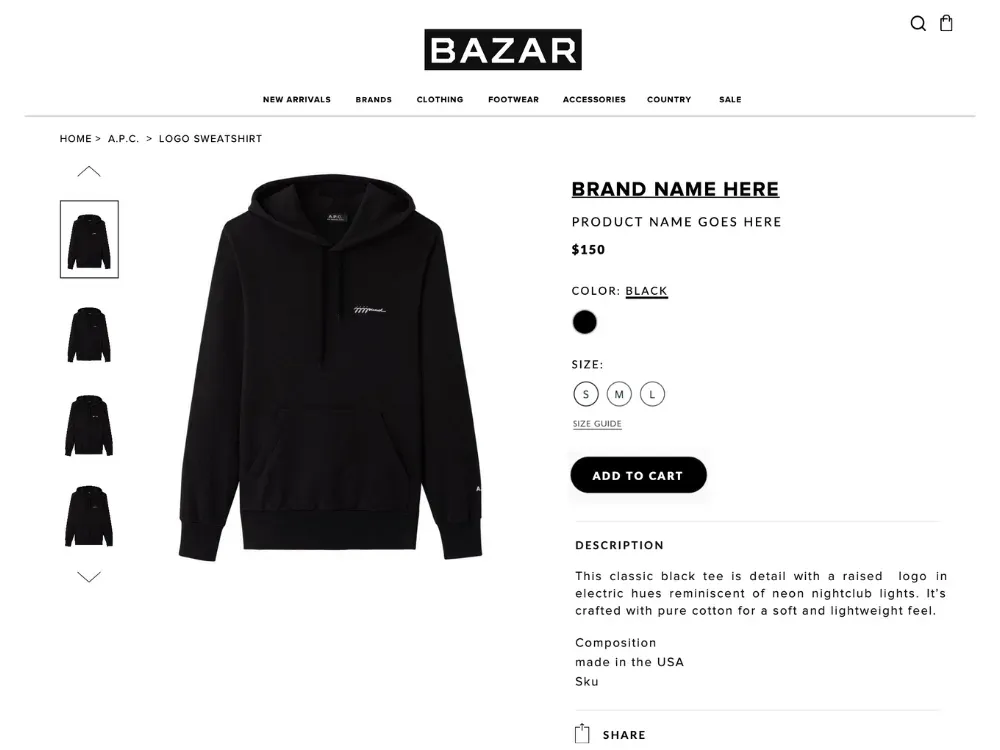
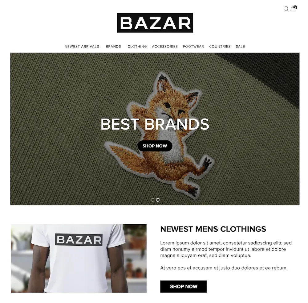
First impressions matter. The visual design of your e-commerce site is the first thing users notice, and it significantly impacts their perception of your brand. A clean, modern design with a cohesive color scheme and high-quality images can make your site feel more trustworthy and professional.
From my professional perspective, investing in high-quality visuals is non-negotiable. This includes everything from your logo and branding to the images you use for your products. I’ve seen e-commerce stores where simply upgrading product images and adjusting the color palette to align with the brand identity resulted in a noticeable uptick in customer engagement.
Consider using tools like Canva for creating visually appealing graphics or Adobe XD for more advanced design work. For inspiration, websites like Dribbble and Behance are excellent resources to see what cutting-edge designs are trending in the industry.

Usability and Navigation
A beautiful design is worthless if users can’t find what they’re looking for. Usability and navigation are critical components of UI/UX design. When designing an e-commerce site, every element must serve a purpose, guiding the user seamlessly from one page to the next without friction.
In my experience, I’ve found that simplicity is key. A cluttered interface with too many options can overwhelm users and lead to decision fatigue. On the other hand, a well-organized site with clear navigation menus, intuitive category structures, and a prominent search bar can enhance the user experience significantly.
One pro tip I’ve learned is to always test your site’s navigation from the perspective of a new user. Tools like Hotjar or Crazy Egg can provide insights into how users interact with your site, helping you identify any bottlenecks or areas for improvement.
Video about optimizing e-commerce site navigation for better user experience
Mobile Responsiveness
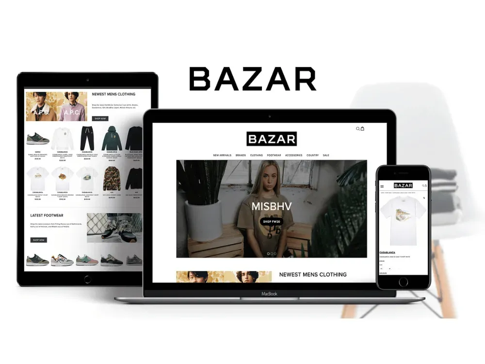
With mobile devices accounting for over half of all e-commerce traffic, having a mobile-responsive design is no longer optional—it’s a necessity. A mobile-responsive website adjusts seamlessly to different screen sizes, providing an optimal user experience whether the customer is shopping on a smartphone, tablet, or desktop.
I remember working on a project where the client’s site wasn’t optimized for mobile. Despite having a significant amount of traffic from mobile users, their conversion rates were abysmally low. Once we redesigned the site to be mobile-responsive, there was a dramatic increase in mobile sales.
Google’s Mobile-Friendly Test is a great tool to check how well your site performs on mobile devices. Additionally, ensuring that your mobile site is fast-loading and easy to navigate is crucial. Remember, mobile users are often on the go, so your site needs to be quick and straightforward to keep them engaged.

Speed and Performance Optimization
Nothing frustrates a user more than a slow-loading website. In the fast-paced world of online shopping, even a few seconds of delay can lead to lost sales. Speed and performance are critical elements of UI/UX design that directly impact user satisfaction and conversion rates.
In one case, a client’s e-commerce site was experiencing high bounce rates. Upon investigation, we found that the site’s load time was significantly longer than the industry standard. By optimizing images, leveraging browser caching, and minimizing the use of heavy scripts, we were able to reduce the load time, which led to a noticeable increase in user engagement and sales.
Tools like Google PageSpeed Insights and GTmetrix are invaluable for analyzing your site’s performance and identifying areas for improvement.
Video about the importance of website speed and how to optimize it for better performance
Accessibility and Inclusivity
Designing for accessibility means ensuring that your e-commerce site is usable by everyone, including people with disabilities. This is not just about compliance with regulations like the Americans with Disabilities Act (ADA) but also about opening your store to a wider audience.
In my years of working with various clients, I’ve learned that accessibility should be integrated into the design process from the start, not treated as an afterthought. Simple adjustments, such as adding alt text to images, ensuring color contrast, and making your site navigable via keyboard, can make a significant difference.
WebAIM’s WCAG 2.1 Checklist is a comprehensive resource that can guide you in making your site more accessible.

Case Studies: Successful E-commerce Sites with Outstanding UI/UX
Example 1: ASOS
ASOS is a prime example of an e-commerce site that excels in UI/UX design. The brand has consistently focused on creating a user-friendly experience with a strong emphasis on visual appeal. Their clean layout, intuitive navigation, and personalized user experience are key factors that have contributed to their success.
One aspect of ASOS’s design that stands out is their use of high-quality imagery and video content. They understand that their audience, primarily fashion-conscious millennials, values seeing products in detail before making a purchase. This attention to detail has helped ASOS build trust and loyalty among its customers.
Example 2: Airbnb
Airbnb may not be a traditional e-commerce site, but its approach to UI/UX design is worth studying. Airbnb’s platform is designed to be user-centric, with a focus on simplicity and ease of use. The site’s navigation is intuitive, and the booking process is straightforward, minimizing any friction for the user.
A standout feature of Airbnb’s design is the use of high-quality images and user-generated content. By showcasing real photos from previous guests, Airbnb adds an element of authenticity to its listings, which resonates with users and enhances trust.
Example 3: Glossier
Glossier is another example of a brand that has leveraged UI/UX design to build a loyal customer base. Their website is a masterclass in minimalism, with a focus on high-quality product images and a seamless shopping experience. Glossier’s design is intentionally simple, allowing the products to take center stage.
What sets Glossier apart is their attention to community and user engagement. Their website features user-generated content and reviews, creating a sense of community that has been instrumental in their growth. This approach to UI/UX design not only enhances the shopping experience but also strengthens brand loyalty.
Best Practices for Implementing Effective UI/UX Design in E-commerce
Conducting User Research
One of the most crucial steps in designing an effective UI/UX for your e-commerce site is understanding your audience. User research helps you gain insights into your customers’ needs, behaviors, and pain points, allowing you to design a site that resonates with them.
In my work with clients, I always emphasize the importance of starting with research. This can be done through surveys, interviews, or analyzing user data from tools like Google Analytics. The goal is to create user personas that represent your target audience, guiding your design decisions.
Remember, designing without understanding your users is like building a product in the dark. For example, I once worked with a small e-commerce startup that was struggling to convert visitors into customers. Through user research, we discovered that their target audience preferred a streamlined, minimalist design with a focus on product details rather than flashy visuals. By redesigning the site based on these insights, we were able to significantly increase their conversion rates.
Prototyping and Testing
Once you have a solid understanding of your users, the next step is to create prototypes and test them. Prototyping allows you to visualize the design and user flow before the site is fully developed. This is where you can experiment with different layouts, color schemes, and navigation structures to see what works best.
In my own practice, I’ve found that prototyping is an essential part of the design process. Tools like Adobe XD or Figma are excellent for creating interactive prototypes that simulate the real user experience. Testing these prototypes with actual users can provide critical insights that help refine the design.
A key lesson I’ve learned is that testing should be an iterative process. Don’t just test once and call it a day. Continually gather feedback and make adjustments until you’re confident that the design meets your users’ needs.
Video about the importance of prototyping and testing in UI/UX design
Continuous Improvement and Updates
UI/UX design is not a one-time task. The digital landscape is constantly evolving, and so are user expectations. This means your e-commerce site needs to be regularly updated to stay relevant and competitive.
In my years of experience, I’ve seen businesses that neglect their website after launch, only to see their conversion rates decline over time. The most successful e-commerce sites are those that continuously improve their design based on user feedback and changing market trends.
For instance, a client of mine who runs an online fashion store saw a drop in sales during a seasonal transition. After analyzing user behavior, we found that the homepage needed a refresh to highlight new arrivals better. A few design tweaks, and their sales rebounded quickly.

The ROI of Investing in Quality UI/UX Design
Cost vs. Benefit Analysis
Investing in quality UI/UX design may seem costly upfront, but the benefits far outweigh the expenses. A well-designed e-commerce site doesn’t just look good—it performs better, attracts more visitors, and converts those visitors into loyal customers.
In my work with various clients, I’ve seen the tangible impact of investing in UI/UX. One of my clients, a mid-size retail business, initially hesitated to allocate a significant budget to redesign their website. However, after seeing a 30% increase in conversion rates and a substantial reduction in bounce rates post-redesign, they realized that the investment was well worth it.
The key takeaway here is that UI/UX design directly affects your bottom line. It’s not just about aesthetics; it’s about creating a user experience that drives results.
Video about calculating ROI from UI/UX design investments
Long-term Benefits
The benefits of quality UI/UX design extend beyond immediate gains. A well-designed e-commerce site can lead to long-term advantages such as stronger customer loyalty, repeat business, and positive word-of-mouth marketing.
For example, one of my long-term clients in the SaaS industry saw their customer retention rate improve significantly after we focused on enhancing their site’s user experience. By simplifying the user journey and adding personalized elements, we created a site that users loved returning to. This not only increased their customer lifetime value (CLTV) but also led to organic growth through referrals.
Quality UI/UX design builds trust and credibility, which are crucial for long-term business success. Customers are more likely to return to a site that offers a seamless, enjoyable experience, and they’re more likely to recommend it to others.

Success Metrics
To measure the success of your UI/UX design efforts, it’s important to track the right metrics. While every business is different, some common key performance indicators (KPIs) can give you a clear picture of how your design changes are impacting your e-commerce site.
In my practice, I always recommend tracking at least the most common metrics like:
- Conversion rate
- Bounce rate
- Average session duration
- Cart abandonment rate
These metrics provide valuable insights into how users are interacting with your site and whether your design is helping or hindering their experience.
For example, after a recent redesign for a client’s online store, we monitored these KPIs closely. We saw a 25% increase in average session duration, indicating that users were more engaged with the site. Similarly, the cart abandonment rate dropped by 15%, suggesting that the new design made the checkout process more user-friendly.
Here are all possible KPI's listed with a short description and a formula on how to calculate them:
| KPI | Description | Formula |
|---|---|---|
| Conversion Rate | The percentage of visitors who make a purchase. | (Number of Sales / Number of Visitors) x 100 |
| Average Order Value (AOV) | The average amount spent per transaction. | Total Revenue / Number of Orders |
| Customer Acquisition Cost (CAC) | The cost of acquiring a new customer. | Total Marketing Spend / Number of New Customers |
| Customer Lifetime Value (CLV) | The total value a customer is expected to generate over their lifetime. | (Average Order Value x Number of Repeat Sales) - CAC |
| Cart Abandonment Rate | The percentage of users who add items to their cart but don't complete the purchase. | (Number of Abandoned Carts / Number of Initiated Carts) x 100 |
| Bounce Rate | The percentage of visitors who leave your site after viewing only one page. | Tracked automatically in most analytics tools |
| Average Time on Site | How long visitors typically spend on your website. | Tracked automatically in most analytics tools |
| Pages per Session | The average number of pages viewed during a single session. | Tracked automatically in most analytics tools |
| Return on Ad Spend (ROAS) | The revenue generated for every dollar spent on advertising. | Revenue from Ad Campaign / Cost of Ad Campaign |
| Email List Growth Rate | The rate at which your email subscriber list is growing. | (New Subscribers - Unsubscribes) / Total Subscribers x 100 |
| Email Conversion Rate | The percentage of email recipients who make a purchase. | (Number of Sales from Email / Number of Emails Delivered) x 100 |
| Net Promoter Score (NPS) | A measure of customer satisfaction and loyalty. | Calculated based on customer survey responses |
| Product Return Rate | The percentage of sold items that are returned. | (Number of Items Returned / Number of Items Sold) x 100 |
| Revenue Growth Rate | The rate at which your revenue is increasing. | (Current Period Revenue - Previous Period Revenue) / Previous Period Revenue x 100 |
| Mobile Traffic and Conversion Rates | The percentage of traffic and conversions coming from mobile devices. | Tracked separately in most analytics tools |
Conclusion: Elevating Your E-commerce Business Through UI/UX Design
Recap of Key Points
As we’ve explored throughout this article, UI/UX design is a critical component of e-commerce success. From visual design and usability to mobile responsiveness and performance optimization, each element plays a vital role in creating a seamless and enjoyable user experience.
To recap, investing in quality UI/UX design can lead to:
- Improved conversion rates
- Higher customer satisfaction and retention
- Increased mobile sales
- Enhanced brand credibility and trust
- Long-term business growth and success
Remember, your e-commerce site is often the first interaction a customer has with your brand. Ensuring that this interaction is positive and memorable is key to turning visitors into loyal customers.
Call to Action
If you’re ready to take your e-commerce business to the next level, consider investing in a professional UI/UX design overhaul. As an experienced digital agency owner, I’ve seen firsthand how transformative good design can be. Whether you’re a small business or a growing startup, a focus on UI/UX can help you achieve your business goals and create lasting relationships with your customers.
Don’t hesitate to reach out for a consultation about your e-commerce UI/UX designs. Together, we can create a strategy that aligns with your business objectives and delivers results.


